CORE STUDIO IV

GENETIC DISEASES CAUSED BY COUSINS MARRIAGE: 

CONDITION STATEMENT:

How we can discourage cousin marriage to prevent illness, serious birth defects, mental retardation, or genetic disease through raising awareness in Qatar, from date to future.

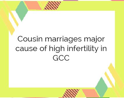
Now a study by the Genetic Counselors says that having a child with your first cousin increases the risk of a significant birth defect from about 3-to-4 percent to about 4-to-7 percent. From this, the media have concluded that marrying your first cousin is “ fine ” Is it?

RESEARCH QUESTIONS:

  1. How old are you?
  2. Are you married? if yes, is your husband/wife your cousin?
  3. Do you encourage or discourage cousin’s marriage?
  4. Are you aware of genetic risks of marriages between first cousins?
  5. Why does marrying closer relatives increase the chance for genetic disease?
  6. Do you think marriage within blood relations may be harmful to the children or next generations ?
  7. How can we prevent the genetic disease?

RESEARCH :

The primary data helped me in my first steps building the condition, aiming for this project, gave me some information based on people’s lives. Secondary research helped from a large number of databases have been developed to make meaningful connections among worldwide scientific discoveries.
MESSAGING:
The message behind this research is to raise awareness and to educate people more about this phenomena.
VISUAL SYSTEM:
  • On the 10th of March I added some more colors to the color scheme.
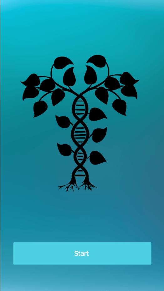
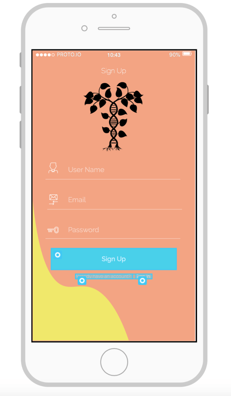
  • On 31 of March I notice that the background of the app looks diffrent and it doesn’t mach with the other mediums so I decided to change the background to orange color, and then I changed the illustration color to bluish grey.
  • On 9th April I changed the color of the tree to purple, which works more with the other medium colors.
COLOR SCHEME:
Screen Shot 2020-03-17 at 09.30.06.png
IMAGERY:
Screen Shot 2020-03-12 at 13.07.40.png
TYPOGRAPHY:
I am using ” orange juice ” as my type for the cards game.
Screen Shot 2020-03-12 at 13.08.42.png
The typeface Im using for the family tree “Raleway”
Screen Shot 2020-04-09 at 11.39.26.png
The typeface Im using for the App called “Raleway”
Screen Shot 2020-03-17 at 20.45.09.png
MEDIA:
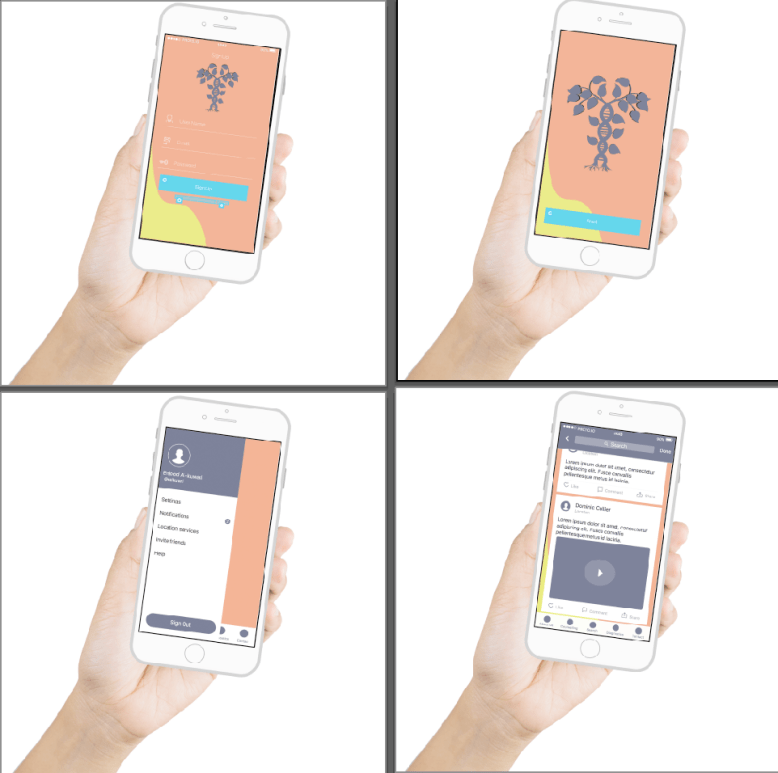
  1. APP  first, because most people carry a mobile device, the simplicity and convenience of apps versus going to a website makes it easier.
  2. PLAYING CARDS Because when you are not relying on, or reading from, a word-for-word text you are free to interact with your audience.
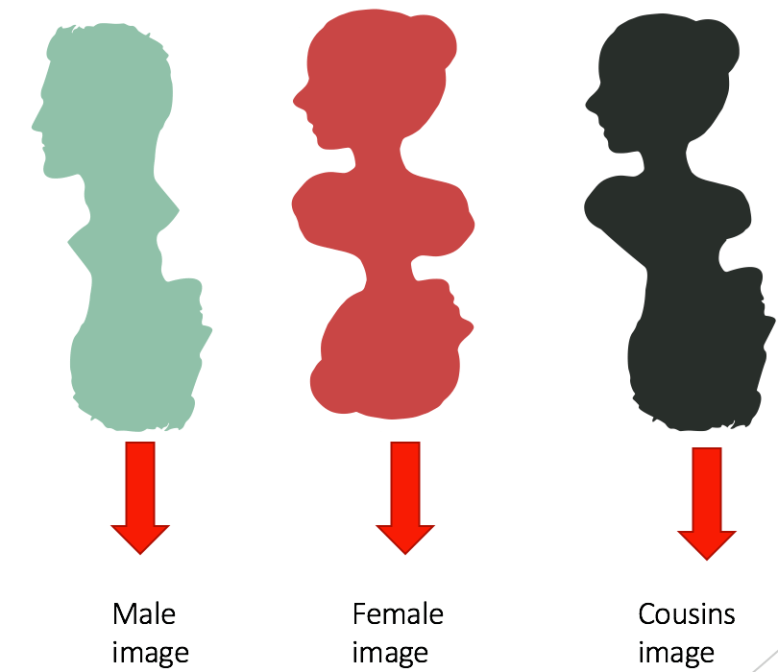
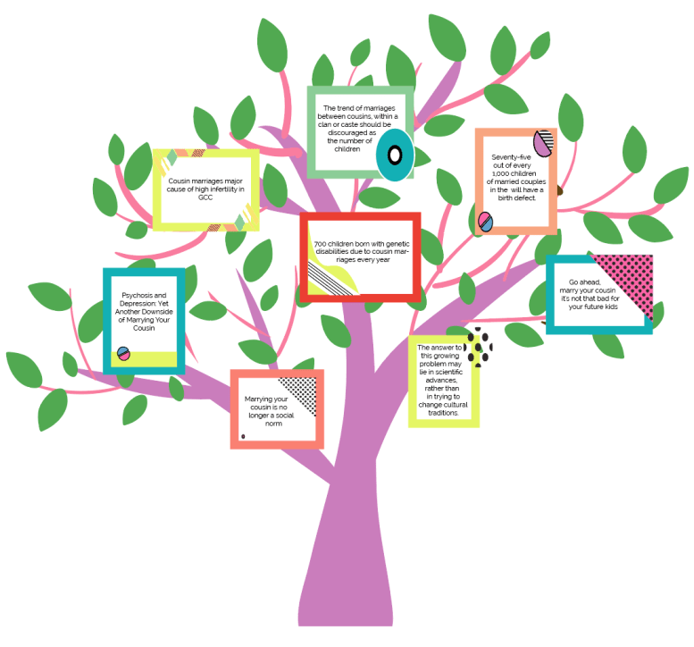
  3. FAMILY TREE   supporting the idea that will contain some information.
GRID AND LAYOUT:
Screen Shot 2020-03-12 at 13.10.16.png

Process:

  •  playing cards

Game rule:

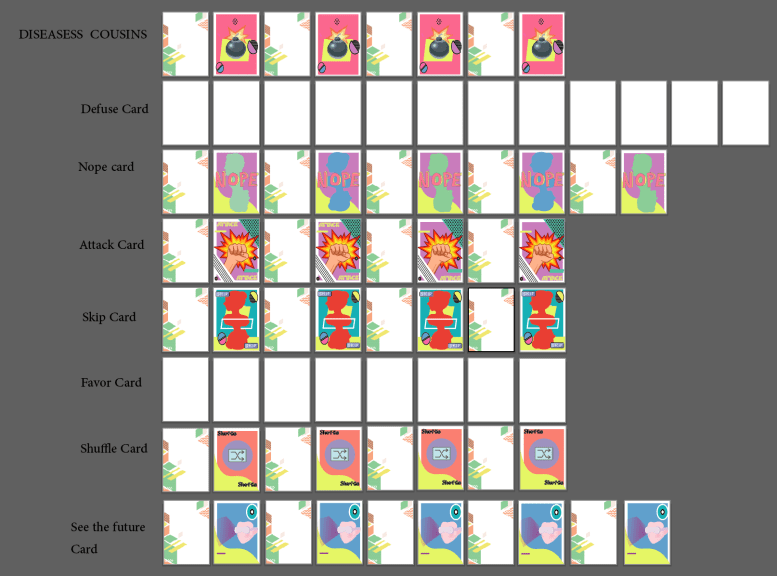
All cards are put into a deck, save for the Defuse, and diseased cousin cards. The deck is shuffled, and each player draws “seven” cards and takes a Defuse card. Diseased cousin cards are then shuffled back into the deck so that the number of diseased cousin cards in the deck is one less than the number of players. The remaining Defuse cards are then also put back in the deck. Turn order is decided upon.

Each player may then play as many cards from their hand as they like on their turn (including none) before drawing a card. Players are not to tell any other player what cards are in their hands. Played cards are put into a discard pile.

The list of cards is as follows:

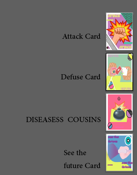
  • Diseased cousin: Eliminates the player that draws it, putting them permanently out of the game. The last player remaining wins the game.
  • Defuse: Allows a player that draws a diseased cousin card to put the card back in the deck in whatever location they choose. This location may be kept secret from other players.
  • Nope: Negates the card that was just played except diseased cousin and Defuses. This card can be played by any player at any time. A Nope card can be negated by another Nope card.
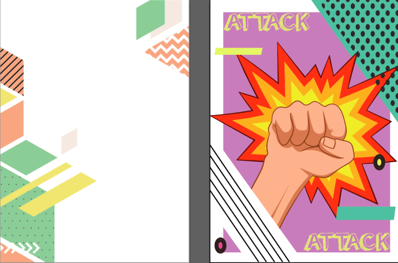
  • Attack: Ends the player’s turn without drawing a card and forces the next player in the turn order to take two turns in a row. Note that if a player affected by an Attack card plays another Attack card on their first turn, both of their turns are ended without drawing, and the following player must take four turns in a row (the number of turns continues to accumulate as more Attack cards are played).
  • Skip: Ends the player’s turn without drawing a card. Note that if a skip card is played by a player affected by an attack card, it will only end one of the two turns.
  • Favor: Forces another player to give the player who played this card a card from their hand. The player affected by this card chooses which card to give.
  • Shuffle: Shuffles the deck until told to stop by another player. The player of this card may not view any cards in the deck while shuffling.
  • See The Future: Allows the player to see the top 3 cards in the deck. The player of this card may not say what cards they saw.
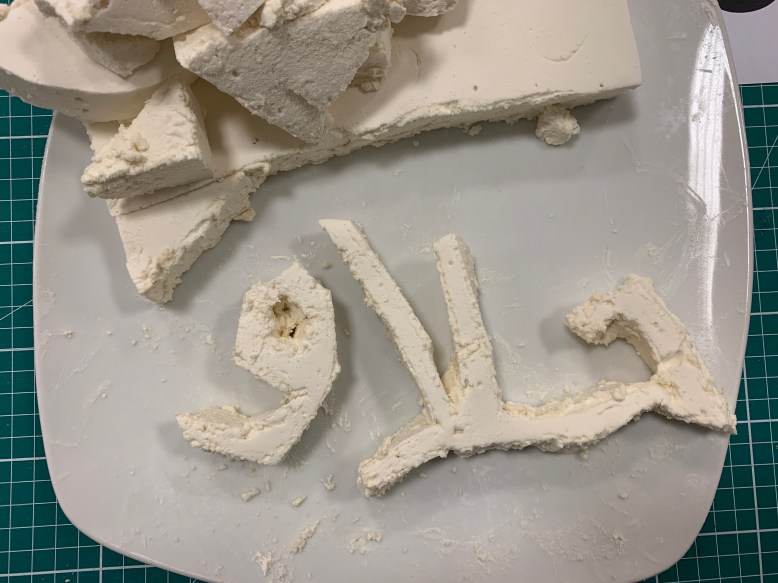
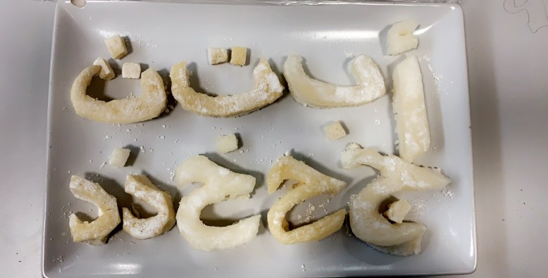
Screen Shot 2020-03-22 at 10.28.59.png

Screen Shot 2020-03-16 at 20.31.05.png
Screen Shot 2020-04-14 at 12.39.03.png
Screen Shot 2020-04-14 at 12.39.26.png
  •  family tree:
Screen Shot 2020-03-16 at 21.13.59.png
Screen Shot 2020-03-16 at 21.25.40.png
Screen Shot 2020-04-09 at 11.45.31.png
  • App:
Screen Shot 2020-03-17 at 14.09.36.png

Screen Shot 2020-04-02 at 10.44.40.png

Screen Shot 2020-04-14 at 12.45.08.png


personal reflection:

Through this project, I learned about several aspects of how to start a project this big. One of these aspects is good lines of communication. It was a long-term design project, and everything was fresh to me. Patience was the crucial and essential factor that was needed in such a long project in my view. Fortunately, I learned and gained patience. Besides, communication was another extremely significant factor. The struggle that I faced in the project was when we had to stay at home because of the virus everything was changed, and as a designer, I have to adapt with this circumstance’s and think of other plans and manage my time more and put more effort to success the project, and I did.


Journey into patterns

This was from the most projects I had fun during it’s process. It began with a trip to Qatar national museum, I took some photos of patterns that I found interesting.

Then at class I pin all my patters and each of my class mates get to stick paper on the pattern that they like.

I visited Souq Waqif to get some inspiration on the product that I am willing to do, that’s when an idea pop up into my mind to make a tote bag made out of old Qatari patterns.

Demystify the Mainstream

The topic that I had chosen to demystify on this project is ” Plastic surgery”, I was thinking at the beginning to make a shock package but after a deep thinking and sitting with my professors I came up with an idea that I like.

I started working on my idea but I didn’t get it right from the first couple of time with my dear professors they guid me to the right way and made me achieve this project.

I started sketching in illustrator and collecting ideas I had 1 week to achieve it or fail it. I worked hard and thanked many hours to plan it right and made it before the due date.

I started collecting ideas and making sketches, thank God I had a wonderful cousin and sister who helped me out in makeup and modeling.

We meet 2 days in an row to make every thing right and make it finish.

IMG_2209.JPG

We played with Arabic type as the target is the Middle East women. I want to achieve from this project that women should have a self confidence and not direct to the fake direction.

IMG_2197.JPG

We set the place ready for makeup and photo shooting.

IMG_2198.JPG

Then I started photo shooting at the first day I photo shoot 5 different photos and on the next day I did the rest.

Image 3.JPG

Image 5.JPG

Image 13.JPG

Image 9.JPG

Then I did some photos with type to send the message behind them. I did Three and photo shoot Three.

Image 83.jpg

I did the colors black and white to make it more focused on the type more than the photograph.

Image 4.jpg

Then I did some type on body corset that represent the women who do their bodies looking for beauty.


After I did some edit on the photos and upload them on my Instagram account that I made as a campaign agains plastic surgery.

I had so much fun making this project a big thanks to my two wonderful professors who did their best making me achieve this project, Also I want to thank my sister Aisha who was my model in this project and Alia the makeup artist without them the outcome wouldn’t be as I thought off.

After finishing my project I was so happy that I had the opportunity to show my work to the visitors that we had from France Nancy. I explained to them the main idea behind the photos and they got to evaluate my work.

IMG_2337.JPG

Emergent Layout

This project involves the design of a book. The content of the book will be structured around the concept of a ‘collection’ and my collection is ” capture of bloodlines”.

For the visual design of the book this project I had been exploring procedural and emergent design principles.

Constraints & Considerations

  • 47 captures included in the collection.
  • 2+ companion pieces of writing.
  • Both text and image have been used in the book.
  • 2+ typefaces “Cochin, Athelas”.

Week 1:

I started thinking of a collection when I get the idea of my bloodline. I stated going through a lot of pictures and albums to achieve this project.

Week 2:

Looking up and searching for books to get inspired of, I spend hours in Pinterest and at library.

IMG_9347.JPG

IMG_3407.JPG


Week 3:

I started creating my paper grid and collecting text.Screen Shot 2019-04-22 at 2.43.41 PM.png

Week 4:

I managed to finish in-advance to prevent delay I sent the book to algarapha printers and had it printed.

IMG_2631.JPG

IMG_2632.JPG


IMG_2633.JPG

IMG_2634.JPG

At the end I want to thank my two professors to give me the aprrtunety and to achieve this project. I had so much fun making the book. What I learned from this project is utilize systems thinking and procedural concepts to manage the layout of a large amount of content over multiple pages and Design procedural systems based on a well defined conceptual premise in order to simplify layout production over multiple pages of the book.

Vest Design

I was introduced to this project by an idea what a “CPR” is and how to do it, it was tough by QRCS training.

Then we have to design a vest for each age group of students.

On this project we had to choose either work on groups or individually. I prefered working in group. My group consists of 3 people “Maryam Al-mannai, Salama Al-mouhannadi and me”.

We give each one a task to do I had the vest design task. Salama had the cord design and Maryam had to choose the colors for each age groups.

We did a sketch on the beggining and collect all the ideas in one vest.

IMG_4965.JPG

The first design was very simple and we had to adjust the design more to improve the design and make it stronger.

Vest-1.jpg

Then we did a initial digital sketch and ideas to define witch is will be constant design for all the vests.

Vest-2.jpg

After designing the front side sketch we did a back side sketch also.

Vest-3.jpg

Then we decided to make the sketch digitally on Illustrator to get the idea more. We decided on this part what parts of the vest are constant and what are not.

Vest-4.jpg

Then we decided to make some changes that wasn’t working on the vest.

Vest-5.jpg

Then at the end we collected each work and put them togather for the final vest.

Vest-6.jpgVest-7.jpg

The alphabet

The alphabet, is my first project in ” type 2 ” in the second semester. I started the project define all words that was handed to me both in Latin and Arabic. In total I have to define 20 pairs Arabic and Latin, in total of 40 opposite words.

  • Arabic: 

مرَارَةُ الشيء : طعم غير مستساغ

حَلاَوَة : مصدر حَلوَ

صدر صناعيّ من حَياة : مقدرة الحيّ على تأدية وظيفته ، ويراد بها الفاعليّة غير الاعتياديّة ، نشاط وعافية

الجغرافيا الحيويَّة : ( الجغرافيا ) دراسة التَّوزيع الجُغرافيّ للكائنات الحيّة

فيزياء حيويَّة : ( الطبيعة والفيزياء ) علم يتناول تطبيق علم الفيزياء على العمليّات والظواهر الحيويَّة

الكيمياء الحيويَّة : فرع في علم الكيمياء يختصّ بدراسة تركيب الموادّ الحيويّة والتغيُّرات التي تحدث في أجسام الكائنات الحيّة

إحصائيَّات حيويَّة : ما يتعلّق بأهمّ الأحداث في حياة الإنسان كالمواليد والموتى وعدد الزِّيجات

شَّقَاءُ : العُسْرُ والتَّعَب

تقاعَسَ عَنِ القِيامِ بِعَمَلِهِ : تَهاوَنَ ، تَأَخَّرَ عَنْهُ

تَقاعَسَ الرَّجُلُ : أَخْرَجَ صَدْرَهُ

تَقاعَسَ الفَرَسُ : لَمْ يَنْقَدْ لِقائِدِهِ

تَقاعَسَ العِزُّ : ثَبَتَ ، اِمْتَنَعَ

الإقْدَامُ عَلَى فِعْلِ الخَيْرِ : التَّقَدُّمُ وَالقِيامُ بِهِ

 تعاسَة سوء حظّ وحال :- نسبة كبيرة من السكان تعيش حياة حرمان

سَعَادَة : فرَحٍ ، ابْتِهَاجٍ ، أيْ كُلُّ مَا يُدْخِلُ البَهْجَةَ وَالفَرَحَ عَلَى النَّفْسِ

مُزَخْرَفٌ : مُزَيَّنٌ بِأَلْوَانٍ شَتَّى

 خاوي:  خَالِي ، فَارِغ , خَالِي

ترتيب:عَلَى تَنْظِيمِهَا ، تَنْسِيقِهَا يَشْتَغِلُ مِنْ غَيْرِ تَرْتِيبٍ

 اضطراب :حالة عدم الاستقرار ، فوضى ، بلبلة ، صَخَب وجَلَبة

دقه :سم مرَّة من دقَّ

تهَاوَنَ فِي عَمَلِهِ : تَقَاعَسَ عَنْهُ ، أهْمَلَهُ

الجَدِيَّة : الناحية

مَزَّاحٌ : كَثِيرُ الْمَزْحِ وَالهَزْلِ

 جميل: صفة مشبَّهة تدلّ على الثبوت من جمُلَ

القبِيحُ : كُلُّ ما يَنْفِرُ منه الذَّوق السَّليم ويأباه العرف العام

زَائِلٌ : عابِرٌ

مُتَأَنٍّ  : مَنْ يَشْتَغِلُ فِي تُؤَدَةٍ وَبُطْءٍ مَعَ تَفْكِيرٍ

  • Latin:

Bitter:having a sharp, pungent taste or smell; not sweet.

Saccharine: excessively sweet or sentimental.

Euphoric: characterized by or feeling intense excitement and happiness.

Miserable: wretchedly unhappy or uncomfortable.

Stultify: cause to lose enthusiasm and initiative, especially as a result of a tedious or restrictive routine.

Galvanize: shock or excite (someone) into taking action.

Dismal: causing a mood of gloom or depression.

Cheerful: noticeably happy and optimistic.

Ornate: elaborately or highly decorated.

Austere: severe or strict in manner or attitude.

Chaotic: in a state of complete confusion and disorder.

Tidy: arranged neatly and in order.

Precise: marked by exactness and accuracy of expression or detail.

Inaccurate: not accurate.

Hilarious: extremely amusing.

Serious: demanding or characterized by careful consideration or application.

Adorable: inspiring great affection or delight.

Repulsive: arousing intense distaste or disgust.

Fleeting: lasting for a very short time.

Leisurely: acting or done at leisure; unhurried or relaxed.

After searching for each word definition I wrote all the words in Arabic and Latin with the font to try the font out I ended with 200 different word in different font.

Week 1:

On Monday I printed the papers and we went to the atrium and laid the papers on the floor in a row and then the professor asked us to walk on them to see them properly.

IMG_6491.JPG

I had chosen 10 different fonts that catches my eyes and I found interesting, 5 in Arabic and 5 in Latin.

” Kufi ” I liked the design way and how the letter is represented and the dots is rounded. It is angular, slow-moving, dignified script. I found it an elegant script.

Screen Shot 2019-01-17 at 11.07.34 PM.png

” Palatino ” it has a classical serif typeface, and highly legible. Very attractive and easily readable.

Screen Shot 2019-01-17 at 11.25.48 PM.png

” Tanseek ” highly legible and approachable designs. An attractive way of writing. Work in perfect harmony.Screen Shot 2019-01-17 at 11.33.26 PM.png

” Badiya ” a modern and slightly modulated. A  clear, legible, and modern text face.

Screen Shot 2019-01-17 at 11.42.24 PM.png

” Yakout Linotype” it is Simplified Arabic font. Has a very dynamic effect. Very interesting slightly curved baseline.

Screen Shot 2019-01-17 at 11.51.45 PM.png


” Helvetica Neue ” legibility and usefulness.

Screen Shot 2019-01-17 at 11.56.18 PM.png

” Bembo ” quiet presence and graceful stability.

Screen Shot 2019-01-17 at 11.59.49 PM.png

” Avenir ” oldstyle and lining figures. It is legible and eminently flexible.

Screen Shot 2019-01-18 at 12.04.03 AM.png

” Bodoni 72 Oldstyle ” its classic style.

Screen Shot 2019-01-18 at 12.08.30 AM.png

” Serif ” bold and italic. The letterforms are distinguished by large x-height, modest stroke contrast, robust wedge-like serifs, and triangular terminals.

Screen Shot 2019-01-18 at 12.19.05 AM.png

Phase 001:

Week 2:

On the second week I started thinking of materials to work with and experiment them. I experiment 10 different letters Arabic and Latin with diffrent type of materials.

The first Material I experemented with is ears cotton, I did the letter “T”, it was challeging in the presenting the letter feature.

IMG_1161.JPG

Next I was interesting in experimenting with thatch ribbon. it was very easy as it its a flexible material I found it very easy in the Arabic letter.

IMG_0941.JPG

Then I played with letter cubes which I found very interesting to use, which came out very interesting letter.

IMG_1802.JPG

Then I found a punch of plastic eyes and I wanted to make silly letter, and which came out very funny.

IMG_0430.JPG

Then I came out with an idea of making letters made out of marshmellows which I found interesting, I look out for some recipies and bought the ingredients and started baking some marshmallow.

On the next class I made the word that I had chosen out of marshmallows and cut it into the word “حلاوه”.IMG_1482.JPG

I spend the weekend making a punch of marshmallows for the following week.

Week 3:

On the third week I consentrated more on the fonts of the marshmellow and how making them on the right way.

IMG_1683.JPG

I did 9 letters on Arabic as a beginning and took photos of each letter under the sun for better light.

IMG_4395.JPG


I spend the third week in photo shooting the 9 letters.

Week 4:

At the beginning of week 4 I had all my 28 letters done and ready to photograph I send the weekend photographing the letter and set them ready to be edited.

IMG_1775.JPG

I ended this phase prodecing over 7 kilos of marshmallow.

ج.png

ح.png

Phase 002:

Week 1:

I send the fist week on phase 002 sketching and building the poster that I am working on for the past weeks.

Week 2:

I send the second week processing and taking pictures of the word to build up the poster.

At the beginning I baked the brownes and then set up the shooting place.

IMG_1056.JPG

IMG_7226.JPG

Then I edit the photos on light room and instaled it on illustrator.IMG_0075-2.jpg

On this poster I faced some fails where my word was illugeble and not clear, the reason why is that I made the word out of alluminum foil and when I want to burn the word the foil burent with it so I ended up with non clear word. I fixed the problem by experementing different materials and the material that worked was acrylic, so I cut the acrylic on my word and got ready to burn some marshmallows.

Week 3:

On the third week which was the submision week I cut the stensil from the acrylic and started making and baking.

On the first class I had my poster almost done, but then I fount out that the quote place is not suitable and the name also so I had to change it and make it ready for the final.


Untitled-5.jpg
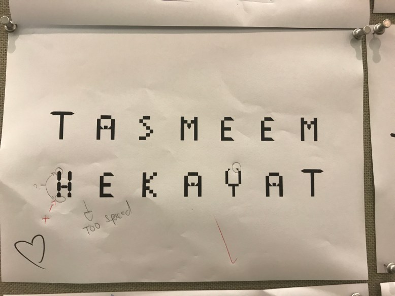
Then I started working on the final poster I changed the qoute position and the name, then I printed it and had it ready to turn in.

PROMO BROADSHEET

This was my final project for typographic”1″. It was a short project that I didn’t send a lot of time doing it.

Other wise I had the experience to try creating a broadsheet using my typeface that I had created previously.

I started this project selecting and trying out different colors for my broadsheet until I found the two colors ” pink, orange, yellow, purple, blue, black and white” interesting together.

I did the front and the back sheet in the front I had a plane orange color background and added on top the pink and yellow colors to give it a nice contrast and then I added my font name which is “pixelated”.

Then I did the back side of the sheet which has on top left the capital letters of my font. On the right side I had the font name.

Then I started playing with my fonts around. On the right side I wrote some description about my typeface.

On the third raw on the left I added the capital and the Lower case together to show the difference. On the right I added the lower case typeface.

On the last raw I added some words to show my font in an sentence, it saies ” PIXEL HERE PIXEL THERE PIXEL EVERYWHERE.” On the right side I added the letters in the lower case.

This is the front side of the broadsheet.

Pixelated broadsheet-2.jpgAnd this is the back page of the sheet.

Pixelated broadsheet-1.jpg

I had so much fun creating the broadsheet and what I am so excited of that I had the experience to do my typeface broadsheet.

Banners

I worked on this project in group of “3”. “2” of us was from Qatar and my second partner was from US. I had experienced in this project to work with a partner that I don’t know any thing about only viewed a video of her introducing her self and texting, at the beginning I was afraid of that experience but at the end I had so much fun working with them.

At the beginning of the project I did a short video introducing my self and talk about a short story that happened. Based on the video my professors put us on groups, I had the opportunity to work with Amna and Ashely.

We did a WhatsApp group to share our thoughts and ideas together, we had chosen to be our topic ” females are paid less than man “.

As the first step I did I researched for examples of banners and had some ideas that I shared latter with my partners.

I worked on Illustrator to make my banner I did some prototypes until I decided with which one I will go.

Screen Shot 2018-11-19 at 4.55.37 PM.png

Then I started making more prototypes and playing with the colors.

Screen Shot 2018-11-27 at 11.23.53 AM.png

My professors told us that we can’t use the color pink in the banner, so I had to change my color pallet to ” orange, black,grey and white ” I shared my color pallet with my partners so all our banners will flow together.

Screen Shot 2018-11-30 at 10.31.10 AM.png

I keep trying to have a final banner and I got some help to get this final banner. I had so much fun making and creating this banner thankgod I didn’t face any difficulties. I am so proud of the final banner and Im so excited to see it hanged.

Performative Exhibition

This was the fist project for this semester I worked as group, my group partners are Salama Almohanadi and Maryam Almanai. I started this project searching for a show that I was interesting in. I spend my weekend binge watching.

Week “1”:

My group and I decided to exhibit ” Sherlock Holmes “. We have chosen the first series the second episode. We had chosen ” Sherlock Holmes” because we like the way of his thinking and we wanted to have everyone els to try and have the opportunity to live and experience the Mistry and investigation life.

We stared analyzing the episode and the characters. Then we build 3 constructs and concepts that we would like to explore as a group.

We spied the work but before starting we had each girl make an sketch of ideas and gather all the strong ideas together to have one main and strong idea that we would present.

IMG_6006.JPG

Week “2”:

By the following week we had gathered the ideas in one sketch and had one idea, but what had concerns me and the group is the wooden house that we had to build. We sit as a group at the break time and tried to solve the problem.It came up then into my mind that we could build the house on our on and at the same time having fun building it.

IMG_6008.JPG

IMG_6009.JPG

At the following day we choose a place to exhibit in and took some photographs of the place and the measurements.

IMG_5970.JPG

On the next day I went to the wood shop and bought 6 large plywood.

We had adjust some ideas on the last sketch on that week to start building the wooden house and looking for things that we need.

IMG_6010.JPG

IMG_6011.JPG

On the weekend I researched for the charechters and some information about them and took some photographs of the main characters in this episode. Then I stared working and building the wooden house. I had faced some problems on that day, 1- The plywood wasn’t big enough for the door I had to make the door smaller to not brake the plywood. 2- I had to thing of a way for transporting the house. 3- the group had to look for a uv light and an invisible ink pen which we couldn’t find in any shop in Doha.

IMG_5998.JPG

IMG_5999.JPG

Week “3”:

In the third week Maryam did a schedule for each one in the group and gave her a task to do in the third week, to be in truck and to have the work done before the exhibition date.

IMG_6029.JPG

On Monday we went to the woodshop to do the sign.

IMG_6027.JPG


After finishing from the woodshop we did a list of each one job and what she will bring to not forget any thing on the exhibit date.

IMG_6026.JPG

We had a problem on that day we couldn’t find the uv light in Qatar, salama looked in different shops but she didn’t find what we are looking for. Salama suggest to visit the material shop in VCU, when we went there we found what we was looking for and helped us a lot, we got excited and can’t wait to start working on it. We borrowed “2” UV lights, 1 glowing color pen and glowing gel.

IMG_6048.JPG

On next class we  vinel cut the foot print, we did them 2 colors black ” as the victim walked towards the dead body” and the red ” as it is leaving after the murder happens.

On the weekend I started painting the plywood to have it finish by the week after it to build it on the following Saturday.

IMG_6111.JPG

Week “4” :

On this week we had every thing ready to set up but we had some issues in the handyman, we had to figure and solve this problem with the university safety facility. On the next class we had this problem solved it end up they are gonna bring us a handyman to help up building the wood house.

On this weekend it was a busy 2 days we give every person in the group a task to do and to bring to be ready for setting up on Saturday.

IMG_6141.JPG

On Saturday we had everything the handyman came around 1 o’clock and they started building the wood house. While they was building it we had an issue the house was very small I had to get more plywood, but when the plywood arrived the handyman told me that he have to go back. We started painting to prefend delays.

On Sunday the handyman came around 2 o’clock and added the last piece. We countinued painting.

I started adding the foot print on the floor, while Maryam painting the front door and Salama hanging the newspapers.

IMG_6152.JPGIMG_6256.JPG

We tried the UV light on that day on the wall to know if it works or not.

IMG_6178.JPG

Maryam wrote the quotes on a paper she made which gave the seen some drama.

IMG_6146.JPG

On the exhibit date we had some issues the newspaper fall off and we had to harry up and make them on time we finished up every thing on the time and the out come of the deconstruction was perfect and every thing goes as we planned.IMG_6252.JPGIMG_6251.JPG

I was so glade to work with Salama and Maryam they worked hard and put a lot of effort to finish this project. If I would do a group project again I would defiantly work with them again.

I fell proud of my self and my group about the out come we had a lot of pressure but we focused to make it happen.

Modular Typeface

I started this project searching for typeface examples to have a background about what the topic is. Then I started taking photos for patterns to draw modules out of the patters.

photo1.jpg       photo2.jpgphoto3.jpg

photo4.jpegphoto5.jpg

After collecting patters I started tracing the modules by a tracing paper and colored it to start making my letters and experiment the letters in Arabic and English.

4A0B37BF-AC9D-4CCE-AB80-0E96F9E13E73.JPG

I did 6 letters in English ” M, V, F, E, J,C “.EABB4D96-9AC0-4B2F-8454-EA9C4586284C.JPG

Then I did 5 letters in Arabic ” Alef, Baa, Waw, Lam and Meem”.

2A30FCD6-7EB2-40DB-92F4-8A55A3D0FDC1.JPG

After experimenting with letters I started making my modules in Glyphs and building my letters. I had chosen to do English letters in upper and lower case.

After finishing the upper case letters which took a lot of time building it, I started building the lower case. But I had a lot of fun building it and creating fonts.

Screen Shot 2018-10-17 at 11.57.53 AM.png

Based on the upper case I stared playing and having more fun crating the lower case which didn’t take much time as the upper case, I think that because I started to figure out  how to build my own font now!!!!!.

Screen Shot 2018-10-21 at 9.16.23 PM.png

After finishing the lower case letters I was so excited to start typing and using my font, so I typed my first typing in Wedesday I wrote ” Tasmeem Hekayat ” which was awesome!!!.

Untitled-1.jpg

After I typed my new font I printed it out and hanged it on the hallway to have it critiqued, the critique helped me to see what is wrong in my letters and adjust them.

IMG_5566.JPG

The critique helped me to improve my typeface more and to know where and what is weak and what is not working in the font. I plan to make the adjustments and make the typeface stronger, I will adjust the spacing, becouse the space is large, the letter ” S ” needs more work to make it more clear. I am trying to find a way to improve the letter ” H ” without changing it’s feature.

After looking to all the letters there are some letters that needs some refinement such as: ” I “

Screen Shot 2018-10-23 at 9.25.40 PM.pngScreen Shot 2018-10-23 at 9.29.10 PM.png

” S “

Screen Shot 2018-10-23 at 9.32.22 PM.pngScreen Shot 2018-10-23 at 9.38.40 PM.png

In this project I had a lot of  trouble with certain letter features because I didn’t know how to make it but then with experimenting and paying with it I figured it out, also I had some problems in the spacing but I did the adjustment later. At the beginning of the project I had noticed that I have to keep in mind the ascender and descender letters, the baseline for each letter and about the width and the hight for both upper and lower case, so I did that from the begging where the upper case in ” 3*7″ and the lower case is ” 3*5″ for some letters.

I had some struggles in glyphs is when I started working on my letters when I was about to finish the letters I had some errors in my glyph and all my letters were deleted and I had two days to work on them again, thank god I succeeded but I had a really hard two days managing my time and finishing them in a short period.

I never know that I can build my own typeface I wasn’t excited at the beginning but when I printed my first words I get more excited and willing to do more in future.

Screen Shot 2018-10-24 at 2.35.29 PM.png


Screen Shot 2018-10-24 at 2.40.08 PM.png

After I started thinking wider and searching for typeface that have a similer features as my typeface and thats what I find out and find interesting.

Oblong0.png

OutWest0.png

thumbnail.png

On the following week I had an critique on my typeface in the unique and memorable, well-designed and well executed, readable and the clearness of the letters, modules used consistently and in a balanced, uniformly sized? Do lower-case letters fit on the x-height? Are all ascenders consistent? Are the width and the  spacing and kerning.

I called my font ” Pixelated “, because the letters are pixelated.

pixelated-1.jpg

pixelated-2.jpg

FullSizeRender.jpg

FullSizeRender 2.jpg

I had 2 people critique my work and based on their critique After the feed back I had adjust the letters and the kerning.

Screen Shot 2018-10-29 at 3.36.44 PM.png

Screen Shot 2018-10-29 at 3.40.03 PM.png

After finishing my typeface I started paying with it and experement it more as extra fun!!!

i need my space-1.jpg

33b68ee82b5115373ab77ba69d0ed594 copy-1.jpg

1e9c283b8a3329efa263c6c62e3364a6 copy.jpg

b7cf51f450a29cfe510c64193d234814 copy.jpg