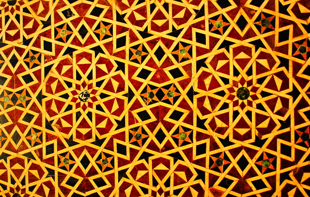
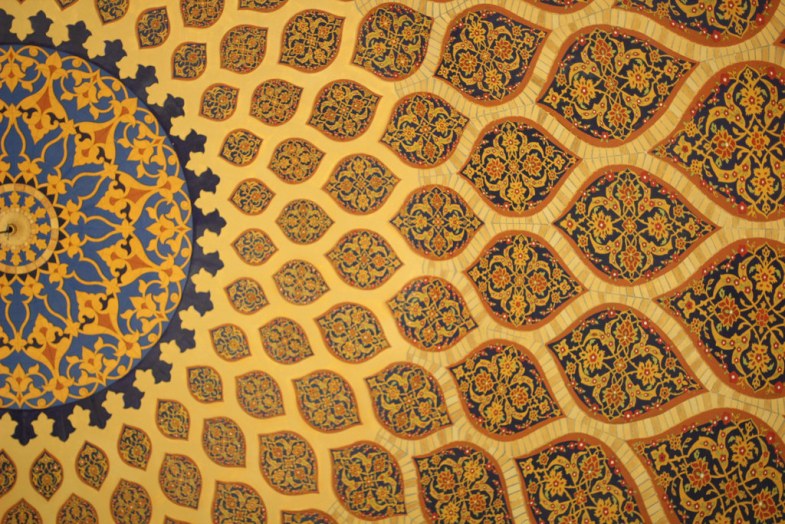
I started this project searching for typeface examples to have a background about what the topic is. Then I started taking photos for patterns to draw modules out of the patters.


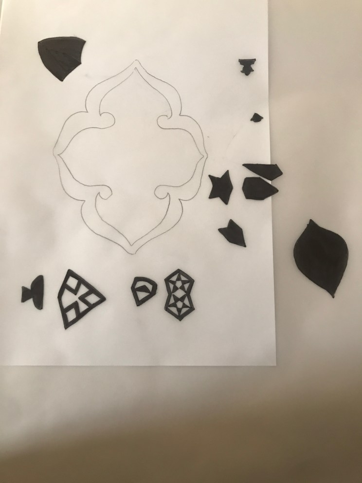
After collecting patters I started tracing the modules by a tracing paper and colored it to start making my letters and experiment the letters in Arabic and English.
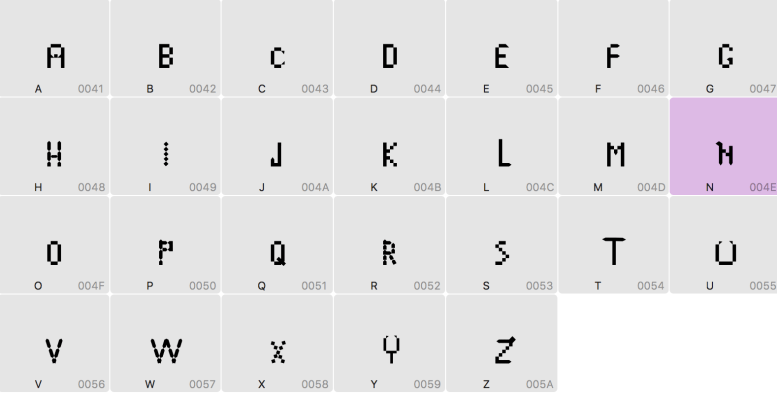
I did 6 letters in English ” M, V, F, E, J,C “.
Then I did 5 letters in Arabic ” Alef, Baa, Waw, Lam and Meem”.

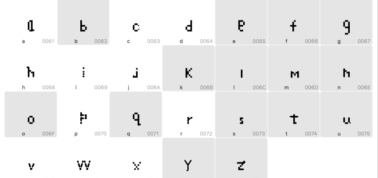
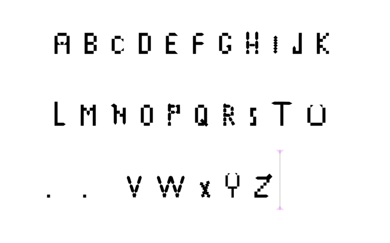
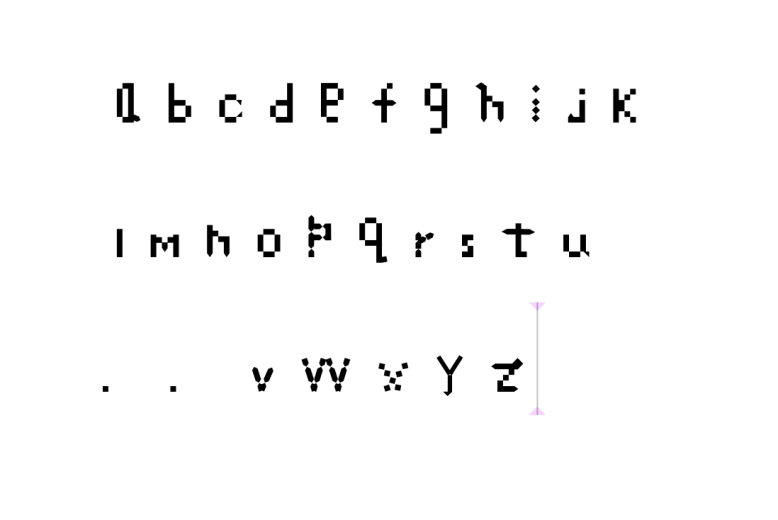
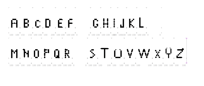
After experimenting with letters I started making my modules in Glyphs and building my letters. I had chosen to do English letters in upper and lower case.
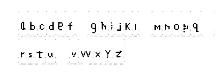
After finishing the upper case letters which took a lot of time building it, I started building the lower case. But I had a lot of fun building it and creating fonts.
Based on the upper case I stared playing and having more fun crating the lower case which didn’t take much time as the upper case, I think that because I started to figure out how to build my own font now!!!!!.
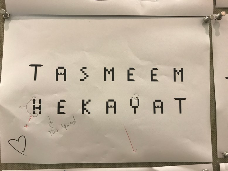
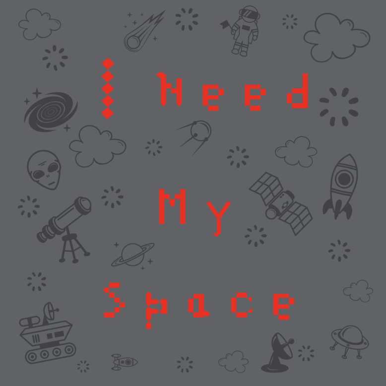
After finishing the lower case letters I was so excited to start typing and using my font, so I typed my first typing in Wedesday I wrote ” Tasmeem Hekayat ” which was awesome!!!.

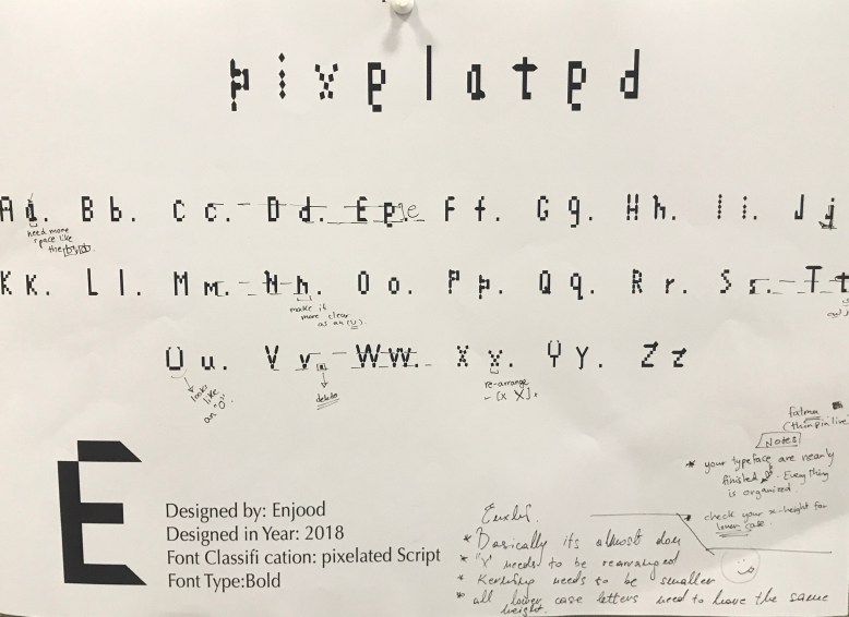
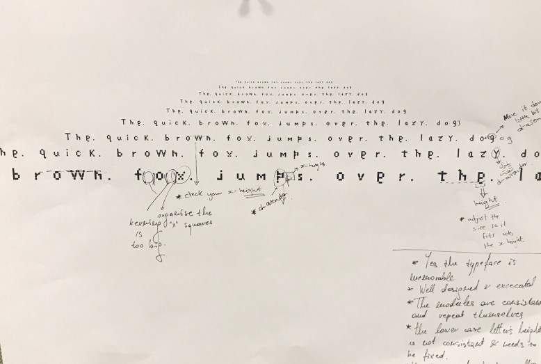
After I typed my new font I printed it out and hanged it on the hallway to have it critiqued, the critique helped me to see what is wrong in my letters and adjust them.
The critique helped me to improve my typeface more and to know where and what is weak and what is not working in the font. I plan to make the adjustments and make the typeface stronger, I will adjust the spacing, becouse the space is large, the letter ” S ” needs more work to make it more clear. I am trying to find a way to improve the letter ” H ” without changing it’s feature.
After looking to all the letters there are some letters that needs some refinement such as: ” I “


” S “


In this project I had a lot of trouble with certain letter features because I didn’t know how to make it but then with experimenting and paying with it I figured it out, also I had some problems in the spacing but I did the adjustment later. At the beginning of the project I had noticed that I have to keep in mind the ascender and descender letters, the baseline for each letter and about the width and the hight for both upper and lower case, so I did that from the begging where the upper case in ” 3*7″ and the lower case is ” 3*5″ for some letters.
I had some struggles in glyphs is when I started working on my letters when I was about to finish the letters I had some errors in my glyph and all my letters were deleted and I had two days to work on them again, thank god I succeeded but I had a really hard two days managing my time and finishing them in a short period.
I never know that I can build my own typeface I wasn’t excited at the beginning but when I printed my first words I get more excited and willing to do more in future.
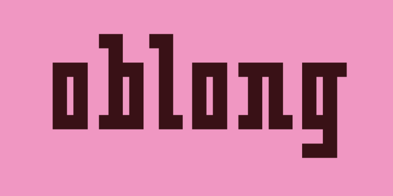
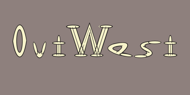
After I started thinking wider and searching for typeface that have a similer features as my typeface and thats what I find out and find interesting.

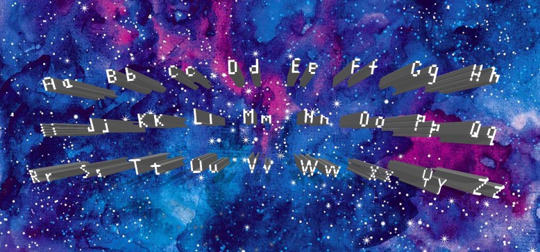
On the following week I had an critique on my typeface in the unique and memorable, well-designed and well executed, readable and the clearness of the letters, modules used consistently and in a balanced, uniformly sized? Do lower-case letters fit on the x-height? Are all ascenders consistent? Are the width and the spacing and kerning.
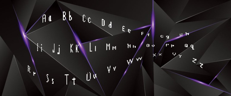
I called my font ” Pixelated “, because the letters are pixelated.
![]()
![]()
I had 2 people critique my work and based on their critique After the feed back I had adjust the letters and the kerning.
After finishing my typeface I started paying with it and experement it more as extra fun!!!


However, I like your letters, I think you should fix the size of some of them because some are bigger than the others.
LikeLike
Hi Enjod, your typeface came a long way and I’m glad you enjoyed the process. However, I would like to make a few comments. Your lowercase “a” is as big as the “b” but it’s not an accender so it should be smaller, same thing with the “e”. Also, the g, j, p, q and y should go down to the descender line. Lastly, the uppercase “X” and “S” look a bit smaller than everything else.
Good luck.
LikeLike
Hi, I found very interesting the fact that you got inspired from the “bitmap” and pushed it to another level to form very original letters! The two aspects I think you should work on are the x-height of your letters, some are higher than they should be such as your lower case “e”. Also, I find that some letters got a little bit lost and does not look like the rest of the family letters, such as your L,T and J.
Good job!
LikeLike
I really liked your typefaces, there are some letters where you could just play around with a little to make them better such as the lower case ‘e’ and the letters that have tails such as ‘ and q’ because they need to go under the descending line. Also, the uppercase “C” is a little too small, if you could just make it slightly bigger then that would be great.
LikeLike
The typeface is unique for me because Its visually appealing and makes my eyes comfortable when I read it. It’s so simple and modern in its style.
It has been well-designed and well thought of even with the simple little details, but It need a little bit of improvement in terms of the x-height. In addition, there are a few letters that need to be adjusted and I have pointed them out like (y,g,e) .You need to re-adjust their position and place them down. I suggest making a global guideline so that your x-height is the same for you letters especially the lowercase.
In terms of changing slightly the design, you need to adjust your (e, x,U) letters.
e: need to be with the x-height letters.
U: It looks more like an O.
x: It looks like you were running late when you did it but you should re-organize it.
It’s legible but there are some letters that need to be readjusted so they can be understood like capital U , and lowercase e.
The models are used consistently as if they are one family. It’s really well designed from this aspect. Great job Enjoud. There was an issue with the spacing (just a component pops out and need to be delete). Otherwise, your spacing and kerning is perfect.
This typeface can be used in games titles or in videogames. In addition, It can also be used in brands.
LikeLike